PPRO
Gutenberg CMS live preview
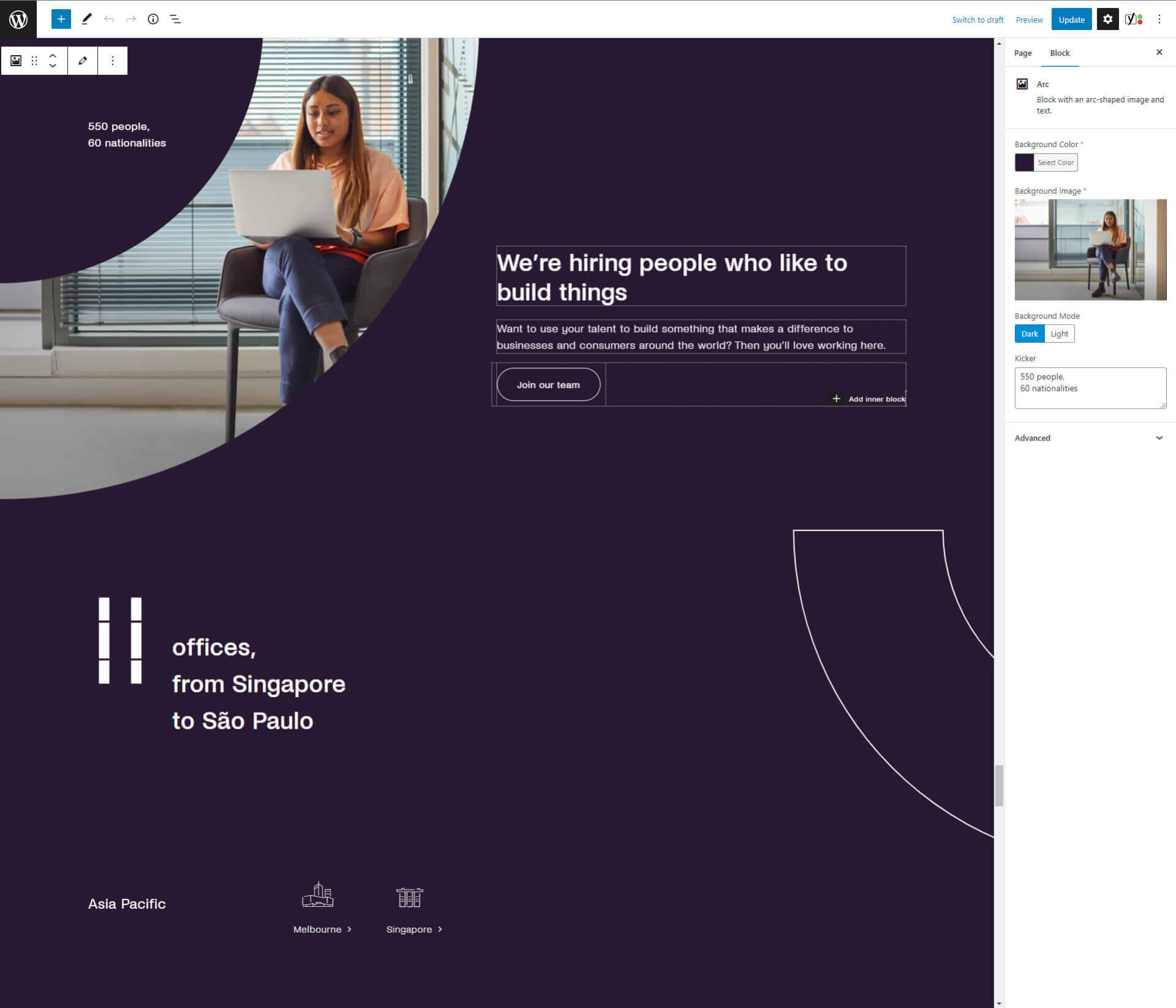
The client PPRO expressed the need for an intuitive CMS in order to be able to manage their own content.
Through a combination of our block-based approach, Gutenberg options and live preview and the usage of Advanced Custom Fields (ACF) we were able to create just that providing PPRO with comprehensive options and allowing full control and overview over the content management process before publishing.
PPRO Website
Section block magic
In order to provide the content editors with flexibility when creating layouts while still making it easy to ensure consistency between elements when needed, all of the content is nested within one parent block we simply call "Section".
The "Section" block is used both to define the relation between content segments and define the visual surrounding of the content. Here are some of the options that it provides:
Section padding
The block has 10+ predefined values for the top and bottom padding of the element. A large number of predefined options ensures consistency while providing a wide range of options.
Vertical spacing
Allowing the user to choose between a narrow or wide vertical spacing between elements within one section.
Custom background options
Choose a background colour or image, define an optional overlay, shape, or round corners of the block and switch between a dark or light mode automatically adjusting text and icon colours.
Content animation
Editors can decide on whether the content should be animated for each section separately.
30+ Online calls
99+ Ideas bounced
14 Colors used
82 Blocks created
Number of blocks
In order to provide PPRO with enough options to cover all their content presentation needs we have created a huge variety of blocks, 82 to be exact (and counting).
We created each block with usage rules which made the backend clean and removed the possibility of errors when entering content.
Their combination allows us to create an unlimited number of unique pages and highlight content where needed.
Number of shapes
With the redesign came a great emphasis on branding. PPRO branding involved a variety of shapes each representing a part of their logo. These shapes were meant to liven up and provide branding within sections with too much whitespace.
For that purpose, we have created a variety of section background options and a special "Shapes" block that can be fit between any two blocks on the website. This resulted in 70+ shape variations reusable throughout the website.
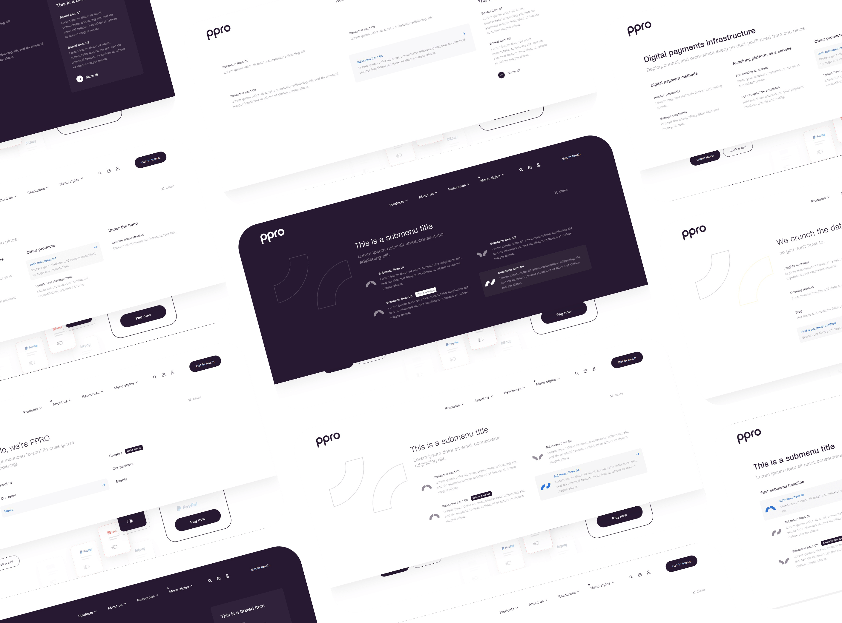
Megamenu variations
PPRO has a lot to offer in terms of services and content and distinctions between groups of content needed to be made. This was done by an extremely variable megamenu with options for:
- Dark and light background
- Branding positioning
- Menu headlines and subtext
- Number of columns
- Various optional link elements like icons, descriptions and badges
- Boxed highlighted content

Typography

Form Builder
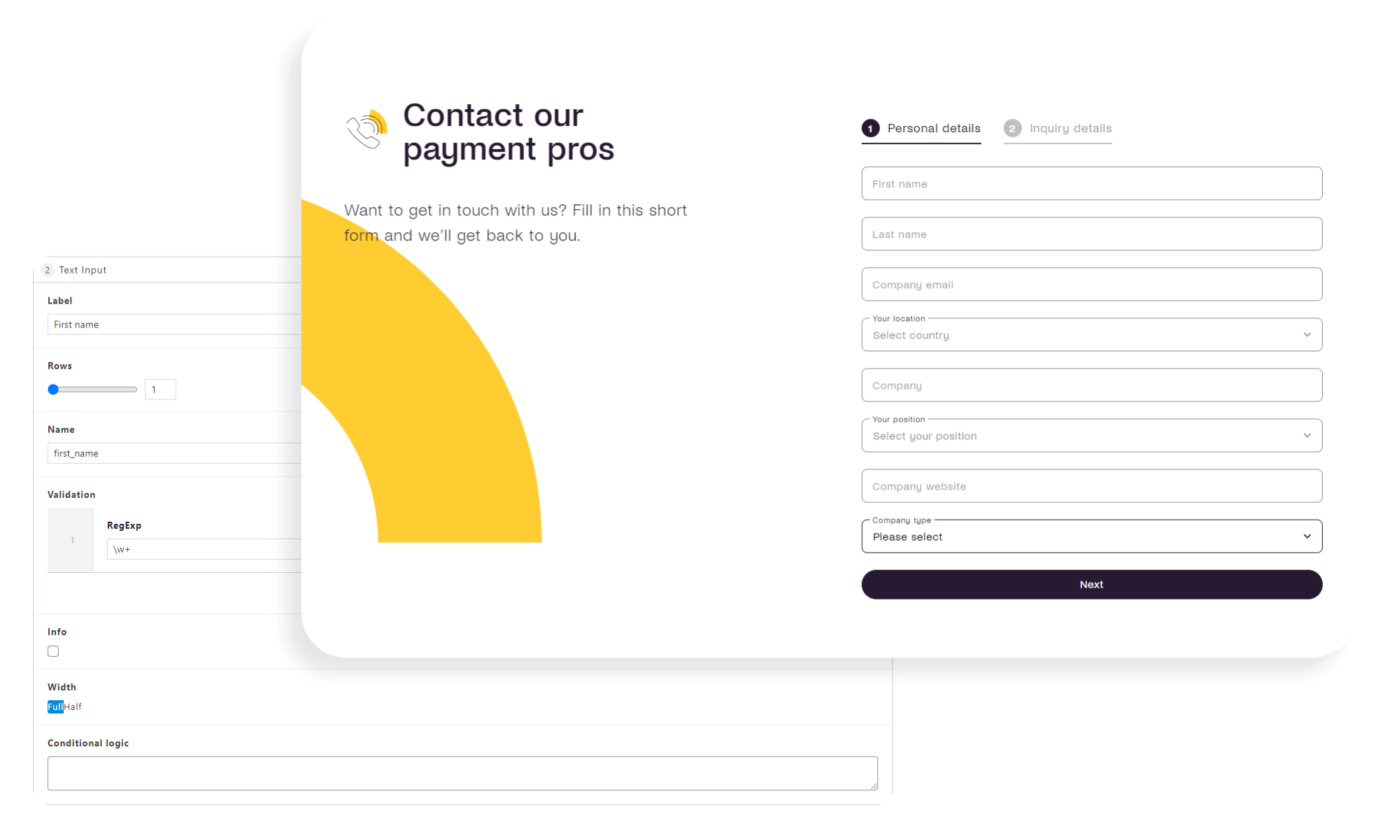
With the sales team, customer support, PR team, event signup and downloads all needing unique forms we have decided to create a form builder for PPRO. Editors are able to create two different types of forms:
- Custom forms as post types which can be included anywhere within the website by using a dedicated "Form" block.
- Two-step forms with that allow creating flows depending on selected options by using conditional logic and custom regex validation.
Each form has the option to define the user notification process as well customizable validation and confirmation messages.

Some additional features include:
Sales form entries are distributed to different departments depending on the keywords within the message.
The download forms are enabled per post and register users for future downloads avoiding multiple registrations.
Custom form handlers with Pardot CRM integration allow for better client follow-up and activity tracking.
Automatic .ics file creation and calendar invitation as well as custom success message calentar invites.

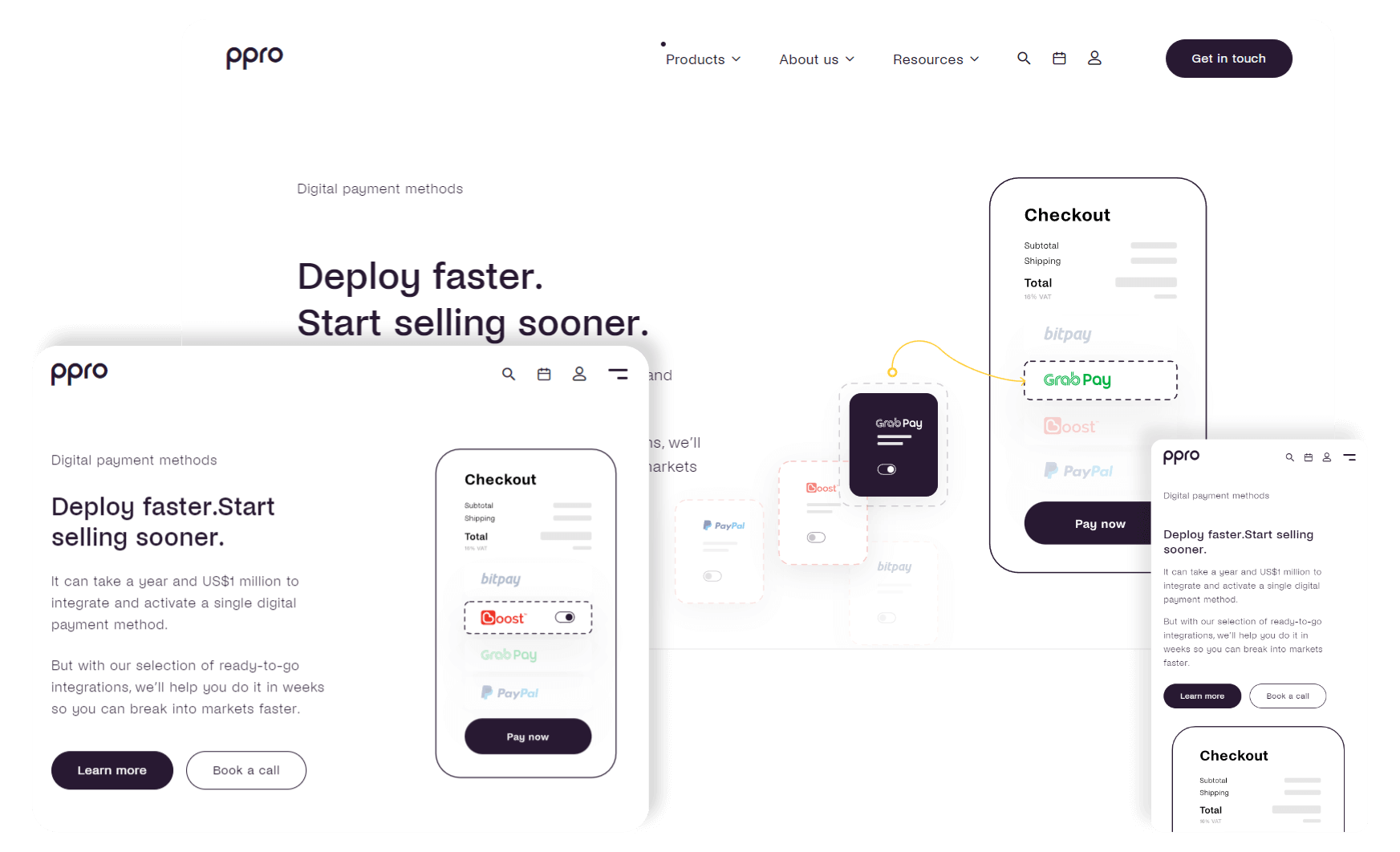
Custom image positioning
Imagery plays a big part in explaining PPRO services and these need to be clear on all resolutions.
Having that in mind we have created a feature that enables the definition of custom breakpoints, as many of them as is needed. Each breakpoint allows the editor to select an image and define the positioning type (relative or absolute), size, as well as its offset from the edges of the block.
Images are switched and positioned in relation to the device's resolution providing full control.
Smart header functionality
User experience plays a great role, especially when the content of the website is extensive and the user needs a simple and intuitive way to navigate through it without the interface always being occupied with the navigation elements.
With that in mind, a special header behaviour was created. The main navigation, which disappears when the user is scrolling through the content, appears each time the user scrolls up anywhere on the website.
This provides the user with easy access to the main navigation bar without it taking precious space when the content is being consumed.
Latest publications teasers
Events, publications and reports are put out by PPRO on a regular basis and the users need to be informed when there's a new one. Besides a regular top bar notification, we created some more elegant solutions:
- Interactive bottom notification bar that only appears when you scroll further down on the website
- Timed notification bubble with adjustable delay timer
Both of these have cookies connected to them with adjustable expiration lengths as well as light and dark modes ensuring consistency with the website's current feel.
Let's build something great together!
We approach projects one at a time with a first come first served attitude allowing us to fully focus our resources on your needs. Hire your dedicated team today.